Introduction to the Plotting Functions in PRECISION.seq
Intro_Figure.Rmd
rm(list = ls())
library(precision.seq)
library(Biobase)
library(vsn)
library(limma)
library(ggplotify)
The package includes a number of plotting functions for comparing the data distribution and analysis results for the test data (before and after normalization) with these for the benchmark data. These functions take one or more of the following three types of objects: (1) sequencing count data, (2) a single set of differential expression analysis results, and (3) a list of multiple sets of differential expression analysis results, with one set for one normalization method being assessed. Besides the nine normalization methods included in this package, users can also assess additional methods by inputting its associated differential expression analysis results.
Differential Expression Analysis Results
## Normalize test data using normalization functions included in the package
test.norm <- pip.norm(raw=data.test, groups=data.group, norm.method = "all")
#> converting counts to integer mode
test.DE <- list(
  TMM = DE.voom(RC=test.norm$TMM$dat.normed, groups = data.group),
  TC = DE.voom(RC=test.norm$TC$dat.normed, groups = data.group),
  UQ = DE.voom(RC=test.norm$UQ$dat.normed, groups = data.group),
  med = DE.voom(RC=test.norm$med$dat.normed, groups = data.group),
  DESeq = DE.voom(RC=test.norm$DESeq$dat.normed, groups = data.group),
  PoissonSeq = DE.voom(RC=test.norm$PoissonSeq$dat.normed, groups = data.group),
  QN = DE.voom(RC=test.norm$QN$dat.normed, groups = data.group),
  RUVg = DE.voom(RC=data.test, groups = data.group,normalized=FALSE, adjust=test.norm$RUVg$adjust.factor),
  RUVs = DE.voom(RC=data.test, groups = data.group,normalized=FALSE, adjust=test.norm$RUVs$adjust.factor),
  RUVr = DE.voom(RC=data.test, groups = data.group, normalized=FALSE, adjust=test.norm$RUVr$adjust.factor),
  SVA = DE.voom(RC=data.test, groups = data.group,normalized=FALSE, adjust=test.norm$SVA$adjust.factor),
  noNorm = DE.voom(RC=data.test, groups = data.group))
benchmark.DE <- DE.voom(RC=data.benchmark, groups = data.group)
Relative Log Expression Plot
Relative log expression plot is the sample-specific boxplots displaying the data deviation of each sample from the median counts across all samples.
fig.RLE(data.test, data.group, "test without normalization")
#> Warning: Removed 367 rows containing non-finite values (stat_boxplot).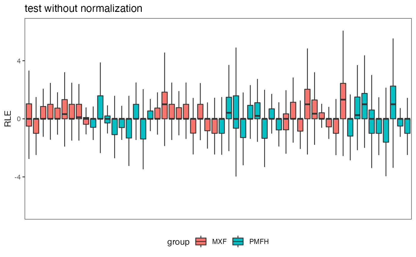
Venn Diagram
Venn diagram is used to compare the differential expression status based on the test data (before or after normalization) with that based on the benchmark data.
fig.venn(benchmark.DE$p.val, test.DE[[1]]$p.val, Pvalue = 0.01)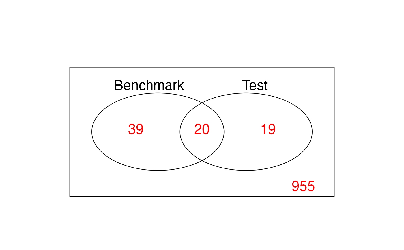
Scatterplot for FNR and FDR
False Negative Rate (FNR) and False Discovery Rate (FDR) are calculated for the test data (before or after normalization) treating the differential expression status based on the benchmark data as a gold standard. Besides the benchmark-data-based gold standard, users also have the option of inputting an alternative golden standard (in the form of a list of miRNA/marker names). Scatter plot is used to plot the FNRs and FDRs among the normalization methods under study.
fig.FDR_FNR(test.DE, benchmark.DE, title = "")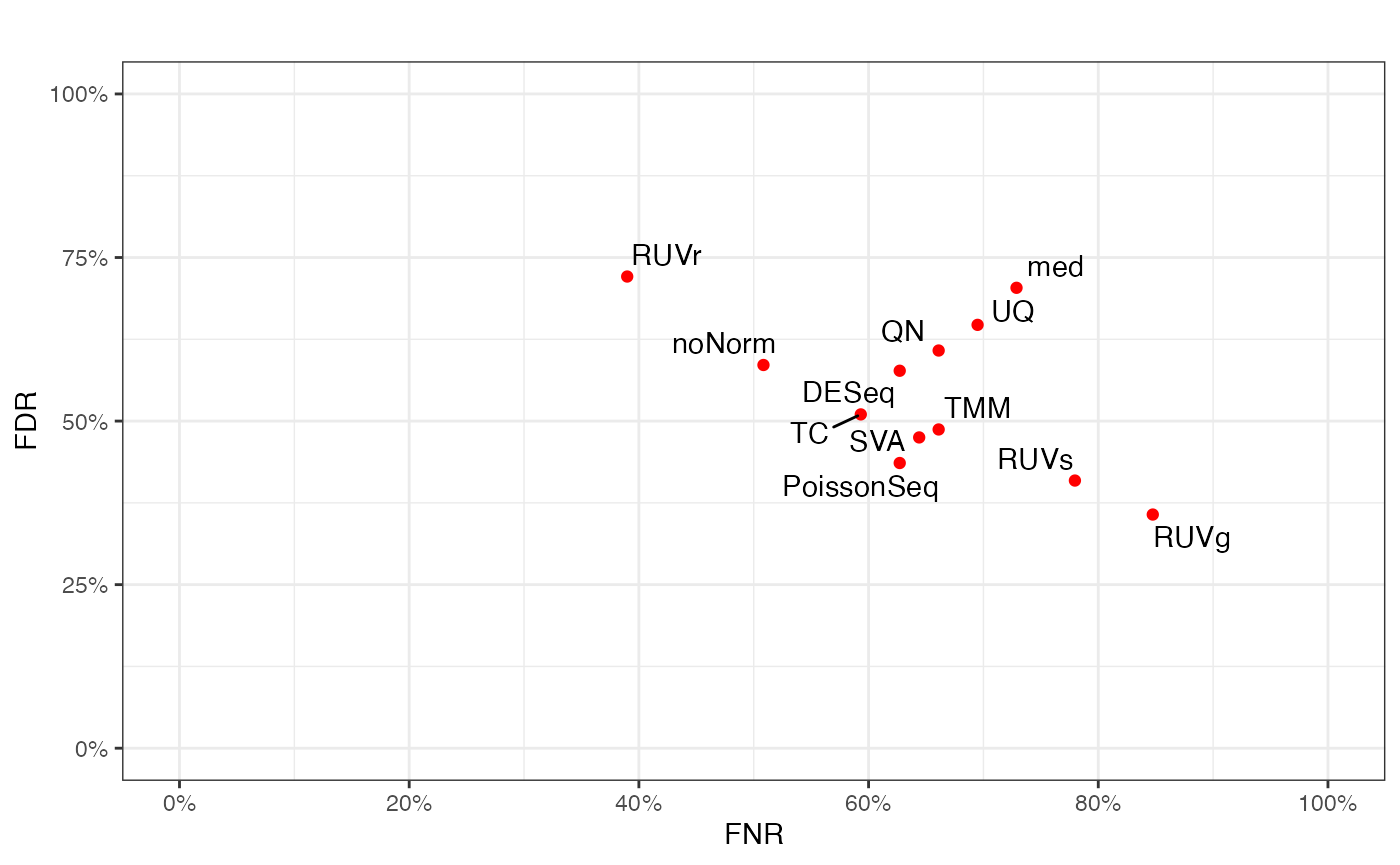
Concordance at The Top Plot
Concordance at the top plot compares the concordance of the ranking for the differential expression p-values based on the test data (before and after normalization) versus that in the benchmark data.
fig.CAT(test.DE, benchmark.DE, title = "")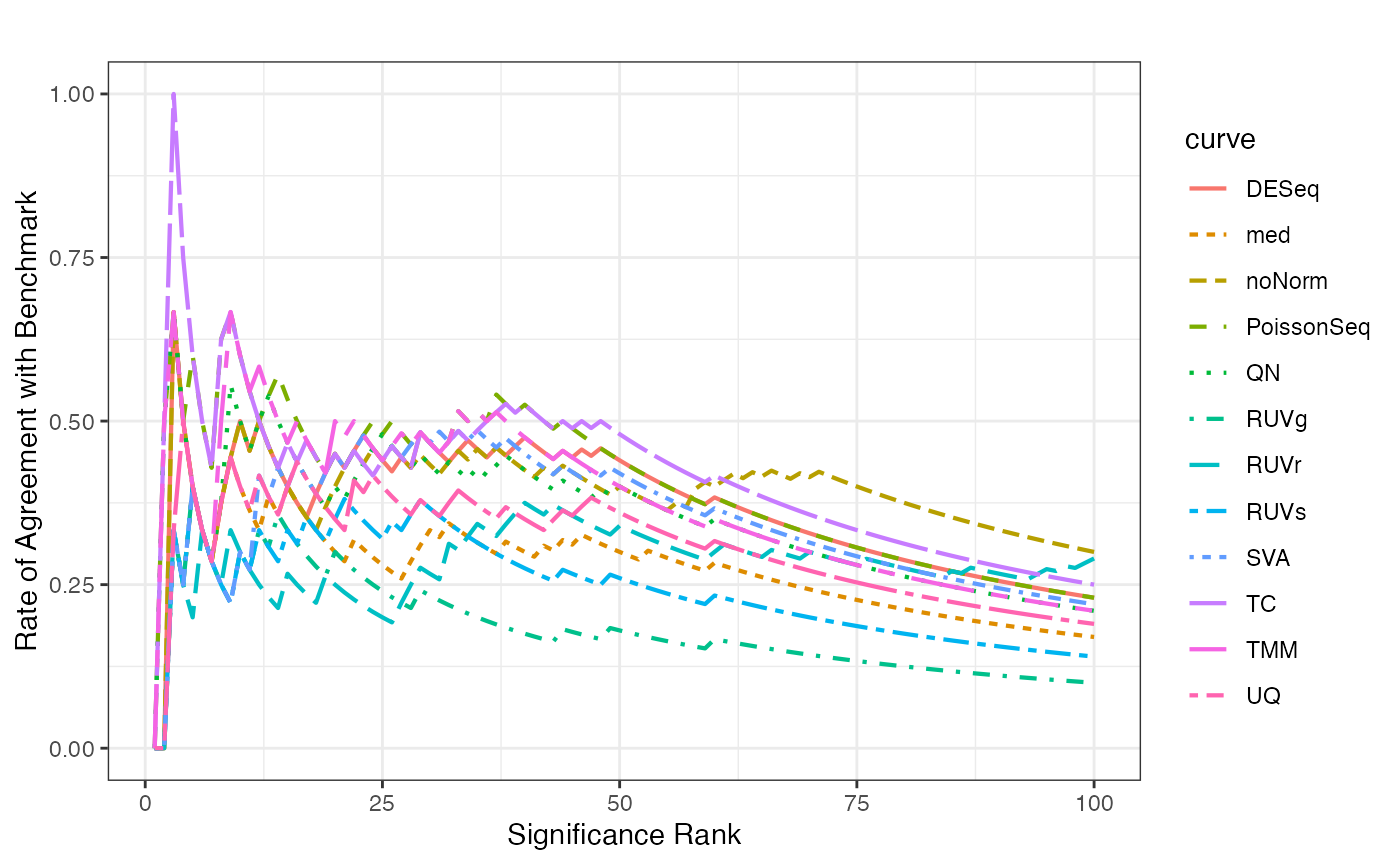
Dendrogram for Method Clustering
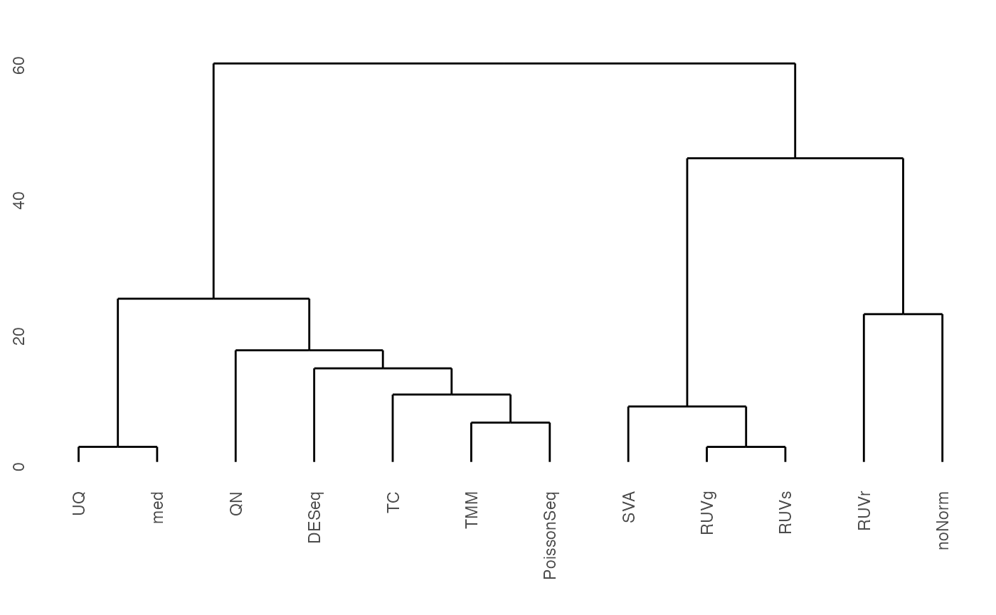
Dendrogram clusters the differential expression p-values for various normalization methods applied to the test data.
fig.dendrogram(lapply(test.DE, function(x) x$p.val), title="")